The right frame doesn’t just hold your artwork. It changes it. A thoughtfully chosen frame colour can make a print feel warmer, calmer, bolder, softer, more modern, more traditional, sometimes all at once. The wrong one can flatten it completely.
When customers ask us how to choose a frame, they’re often expecting a rule. Black for modern. Oak for warm interiors. White for minimal homes.
But framing isn’t about rules. It’s about balance.
Here’s how to think about it properly.
Start With the Artwork, Not the Room
The first mistake people make is matching a frame to their sofa before they’ve considered the artwork itself. Your frame should respond to the tones within the piece. Look closely. - Is the print warm or cool? - Soft or graphic? - Light and airy, or rich and moody?
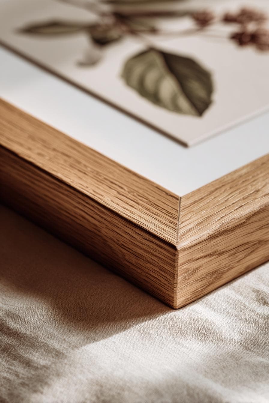
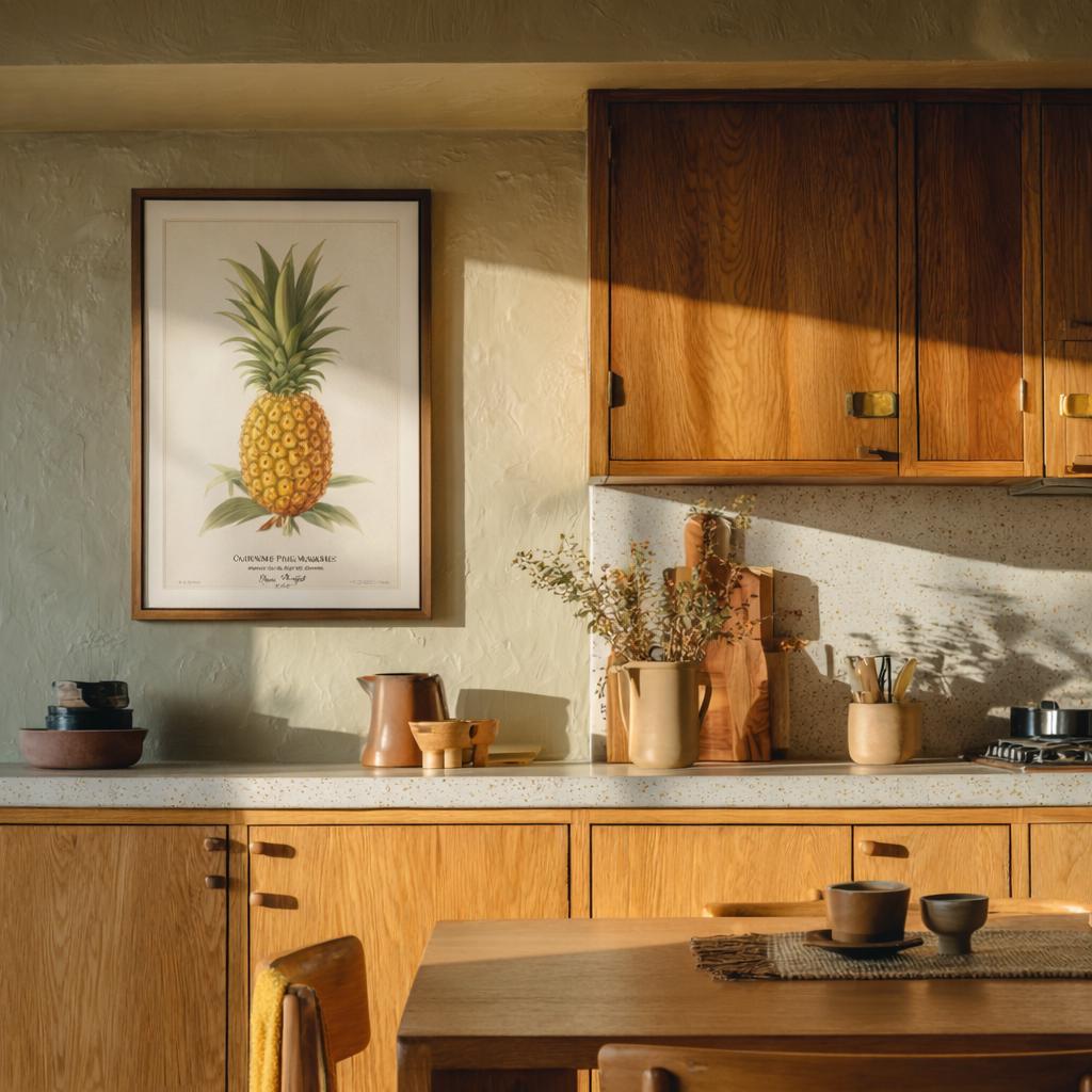
If your artwork carries terracotta, mustard, ochre or deep brown tones, a warm oak frame will echo that warmth beautifully.
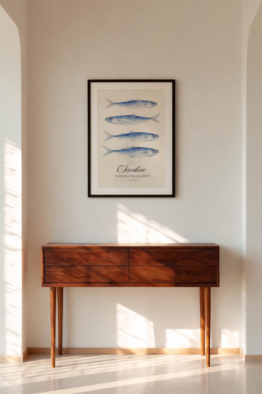
If it’s crisp and graphic, bold black lines, high contrast, a black or dark walnut frame can sharpen the composition. Sometimes the best choice is pulling out a quiet secondary colour from the piece, rather than the obvious dominant one. It creates cohesion without feeling forced.
When in doubt, ask: does the frame elevate the artwork, or compete with it?
Frame Size and Proportion Matter More Than Colour
It’s not just the colour that changes a piece, it’s the weight. A slim, clean frame keeps the focus on the art. A deeper, heavier frame adds presence.
We almost always recommend restraint.
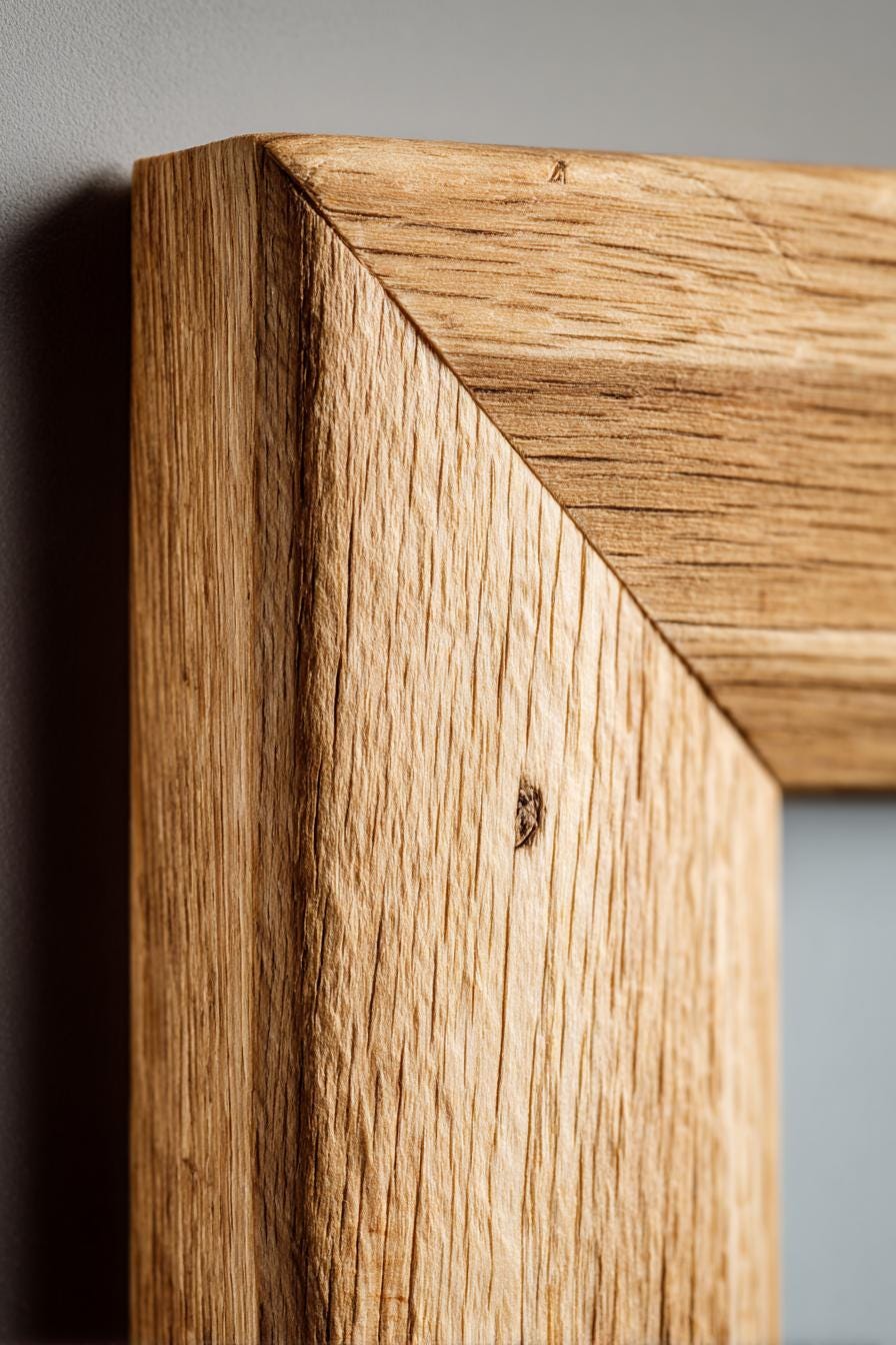
A frame under three inches wide tends to feel refined rather than overwhelming. Especially with mid-century, retro or naturalist prints, where clean lines and composition matter. If the artwork is detailed or delicate, keep the frame simple. If the artwork is bold and graphic, you can afford slightly more structure. Think of the frame as punctuation, not the headline.
Wood or Metal?
This is less about trend and more about mood.
Wooden Frames
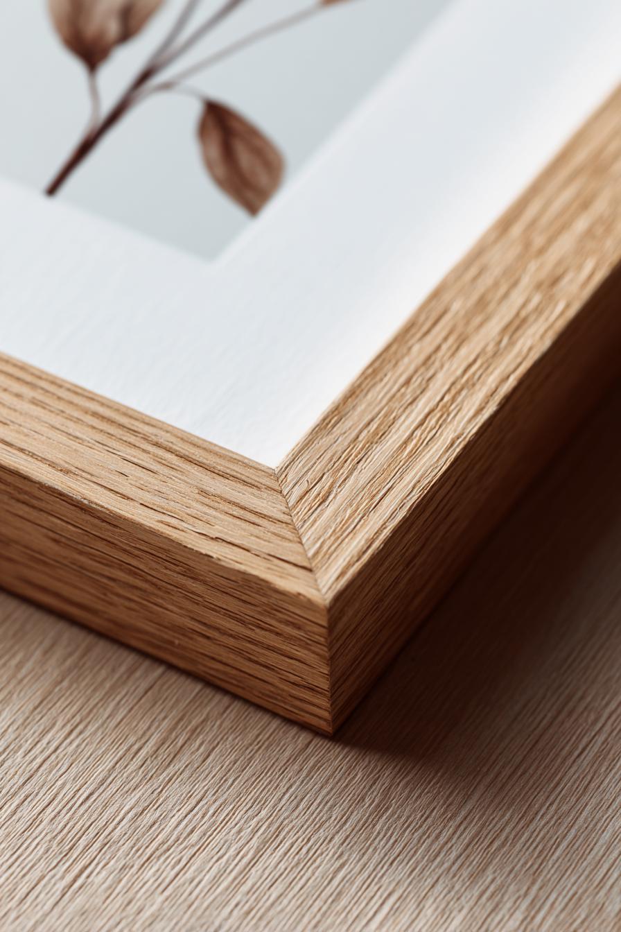
Wood frames bring warmth immediately. Oak, walnut and lighter natural finishes soften a room and work beautifully with botanical prints, coastal artwork, and vintage-inspired illustrations. They feel timeless. Lived-in. Considered. Wood is especially effective in spaces that already carry natural texture — linen sofas, woven rugs, warm-toned furniture.
Metal Frames
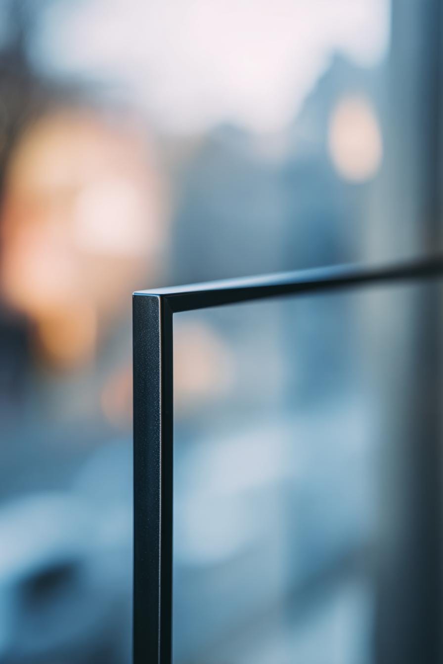
Metal frames feel sharper and more contemporary. Black, brushed brass or chrome finishes can add contrast and definition, particularly with abstract or graphic artwork. In minimalist or modern interiors, metal can provide that clean architectural edge. Neither is better, they simply tell different stories.
Think About the Room, But Don’t Match It
Once the artwork feels right, then look at the space. You don’t need to match the frame to your furniture exactly. In fact, that can feel overly coordinated. Instead, consider harmony. If your room is filled with warm walnut tones, a slightly lighter oak frame can create subtle contrast without clashing. If your space is neutral (cream walls, soft grey upholstery) a black frame can add structure and definition.
Let the artwork be the bridge between your room’s colours. And remember: contrast is not conflict.
When to Choose Neutral Frames
Black, white and natural wood are classics for a reason. A white frame keeps things light and airy. Black creates focus and clarity. Natural oak adds warmth without overpowering. If you’re unsure, neutrals are your safest option, especially with mid-century prints, travel posters, coastal artwork and vintage botanicals. They allow the artwork to remain the hero.
The Quiet Power of Mounts (Matting)
A mount (or mat) changes everything. A cream or off-white mount adds breathing space around a print. It softens the transition between artwork and frame. It can also make a smaller print feel more substantial on a larger wall. For warmer artwork, choose a mount with a slight warmth rather than bright white, it prevents the piece from feeling stark.
Mounts aren’t just decorative. They create balance.
Light Matters More Than You Think
If your room doesn’t get much natural light, frame choice becomes even more important. Lighter wood finishes and cream mounts can lift darker walls. Glass with proper UV protection protects colours from fading over time, especially important in bright kitchens or sunlit living rooms. Good framing isn’t just about appearance. It’s about preservation.
Framing for Different Interior Styles
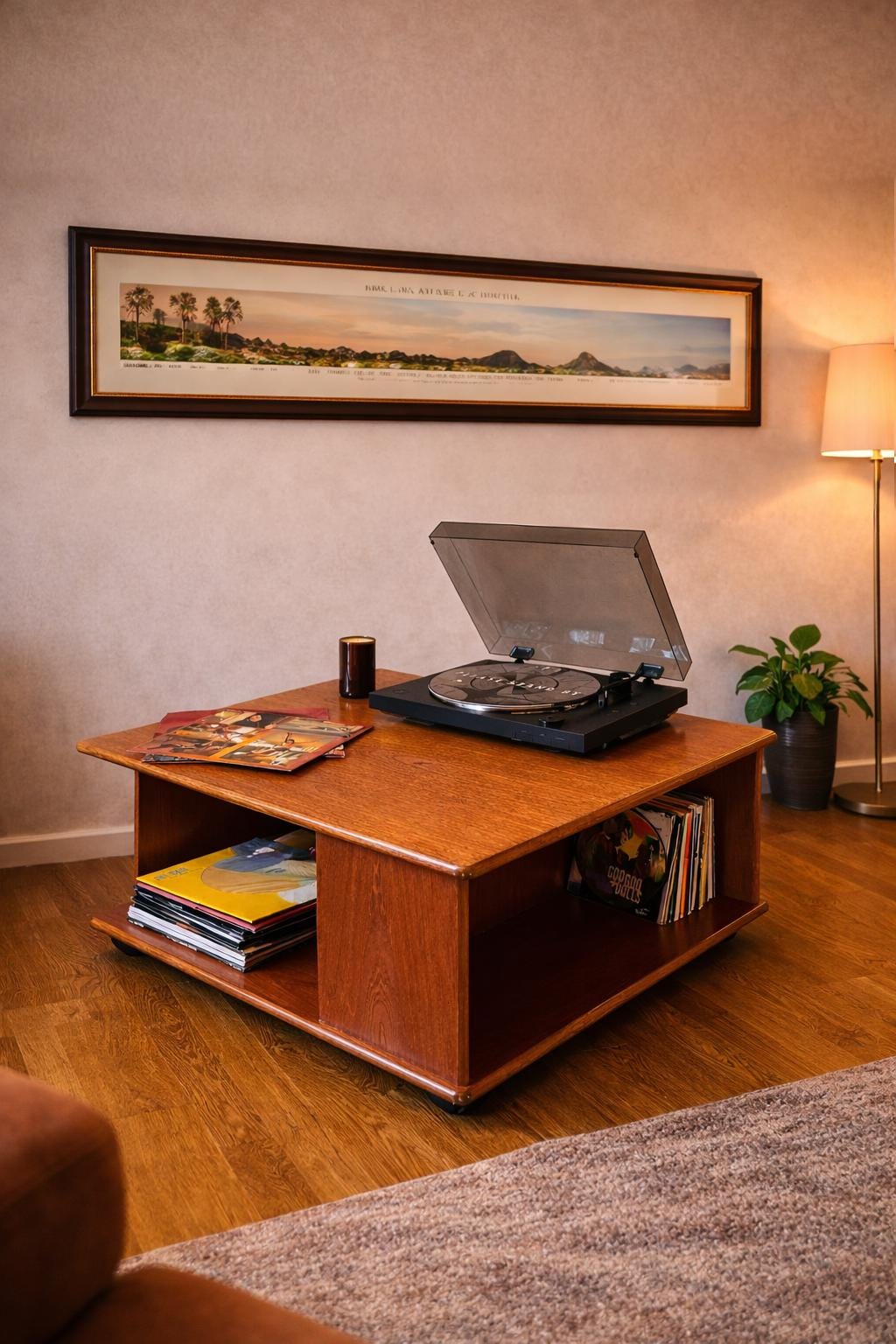
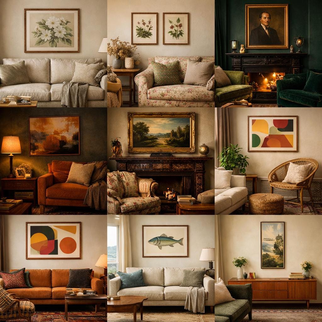
Different interiors call for different framing approaches. In a modern farmhouse living room, a simple oak frame around a botanical or landscape print feels restrained and intentional. In a moody vintage space with deep green walls and brass lighting, a darker walnut or black frame adds depth. In a 70s-inspired interior, warm wood frames complement terracotta and mustard tones beautifully, especially with retro abstracts or travel-style prints. Mid-century modern interiors benefit from clean silhouettes. teak tones, slim profiles, strong composition. The key is consistency. If you’re hanging multiple pieces, keep the frame finish aligned. It creates cohesion instantly.
Protecting Your Artwork Properly
If you’re investing in quality art, the framing should protect it properly. Acid-free mounts prevent long-term damage. UV-protective glass reduces fading. Museum-grade glazing offers the highest clarity and protection. It may feel like a small detail, but over time it makes a significant difference. A good frame doesn’t just make art look better, it keeps it looking better.
Choosing a frame colour isn’t about following a trend. It’s about understanding balance.
The artwork should lead. The frame should support. The room should feel cohesive, not contrived.
When the walls feel considered, the whole space settles. Making the art belong