There’s a particular kind of quiet that comes from living with botanical art. Not the empty kind, more the feeling you get in old libraries, winter gardens, or sun-washed Mediterranean rooms where time seems to slow right down.
Vintage botanical prints have a way of doing that. They don’t shout for attention. They invite you to look closer. If your walls feel unfinished rather than blank, botanical prints offer something rare: beauty, history, and calm, all in one frame.
Why Botanical Prints Work So Well in Modern Homes
Botanical illustrations were never created as “art” in the modern sense.
They were records, carefully observed, scientifically accurate, and intended to last.
That’s why they still work so effortlessly today. A lemon branch heavy with fruit. An olive cutting mid-harvest. A palm tree rendered with architectural precision.
They’re documents of the natural world, and that timelessness makes them incredibly versatile. Whether your space is modern, rustic, coastal, or quietly traditional, botanical prints soften hard edges and add warmth without clutter.
The Lemon Print: Light, Optimism, and Mediterranean Ease.
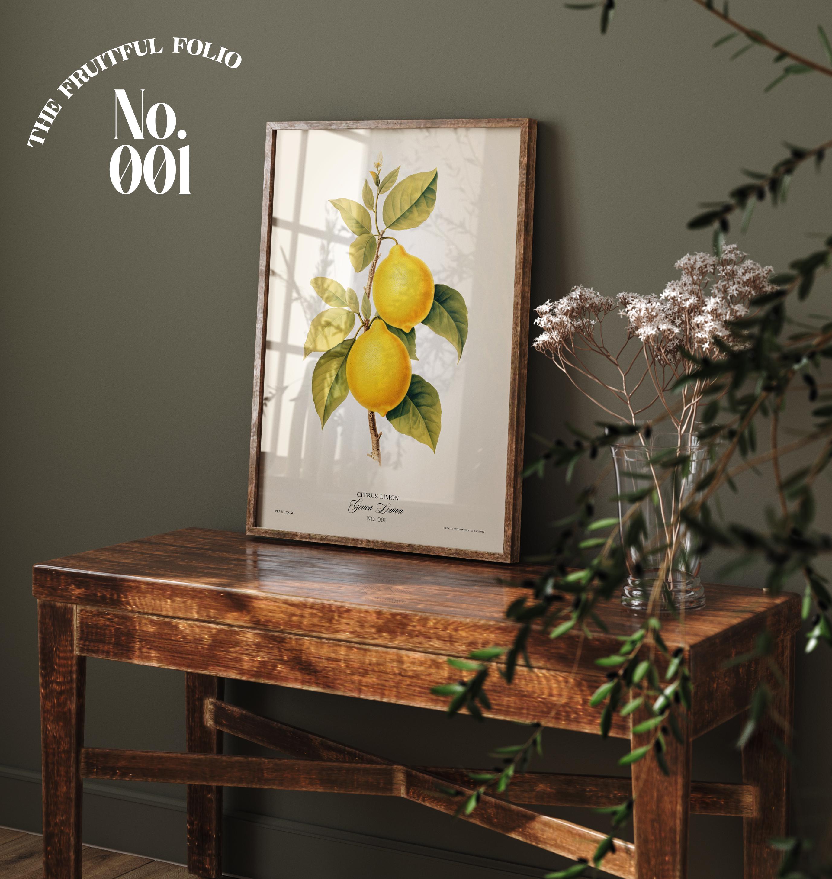
A lemon illustration instantly changes the mood of a room. There’s something undeniably uplifting about it, the saturated yellow against soft paper tones, the gentle curve of the fruit, the glossy leaves catching imagined sunlight.
In kitchens, dining spaces, or breakfast rooms, lemon prints feel natural, almost inevitable. Placed on a console or shelf, as seen in the styled image with the warm wooden table and muted green wall, the lemon print becomes a focal point without dominating the space.
It suggests warmth, generosity, and a connection to southern landscapes such as Italian courtyards and French kitchens, places we celebrate the late afternoon light.
The Olive Print: Quiet Sophistication and Longevity.
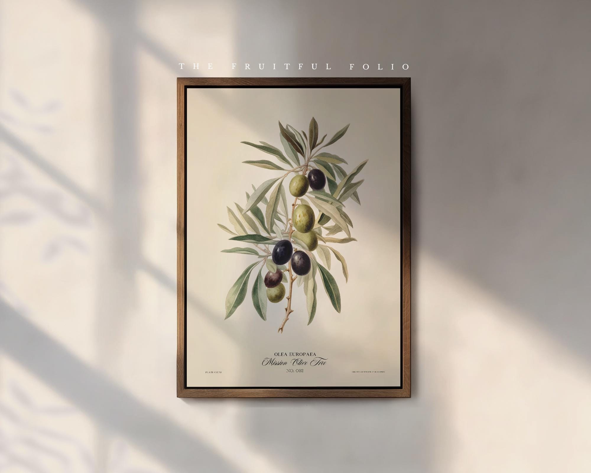
Olive branches carry symbolism almost everywhere they appear.
Peace, resilience, continuity.
But beyond meaning, olive illustrations are visually calming in a way few subjects manage. The muted greens, the soft silvery undertones of the leaves, the contrast between ripe and unripe fruit, it’s subtle, restrained, and incredibly elegant.
The single framed olive print works beautifully on its own, especially when given space. Hung where light moves across the wall, the illustration changes throughout the day, picking up shadows and warmth. It feels considered, grown-up, and timeless. Olive prints are perfect for living rooms, studies, and hallways. Places where you want depth rather than drama.
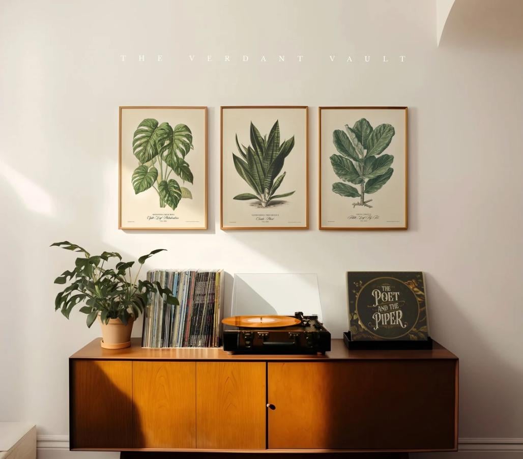
Monstera and Palm Prints: Structure Meets Softness
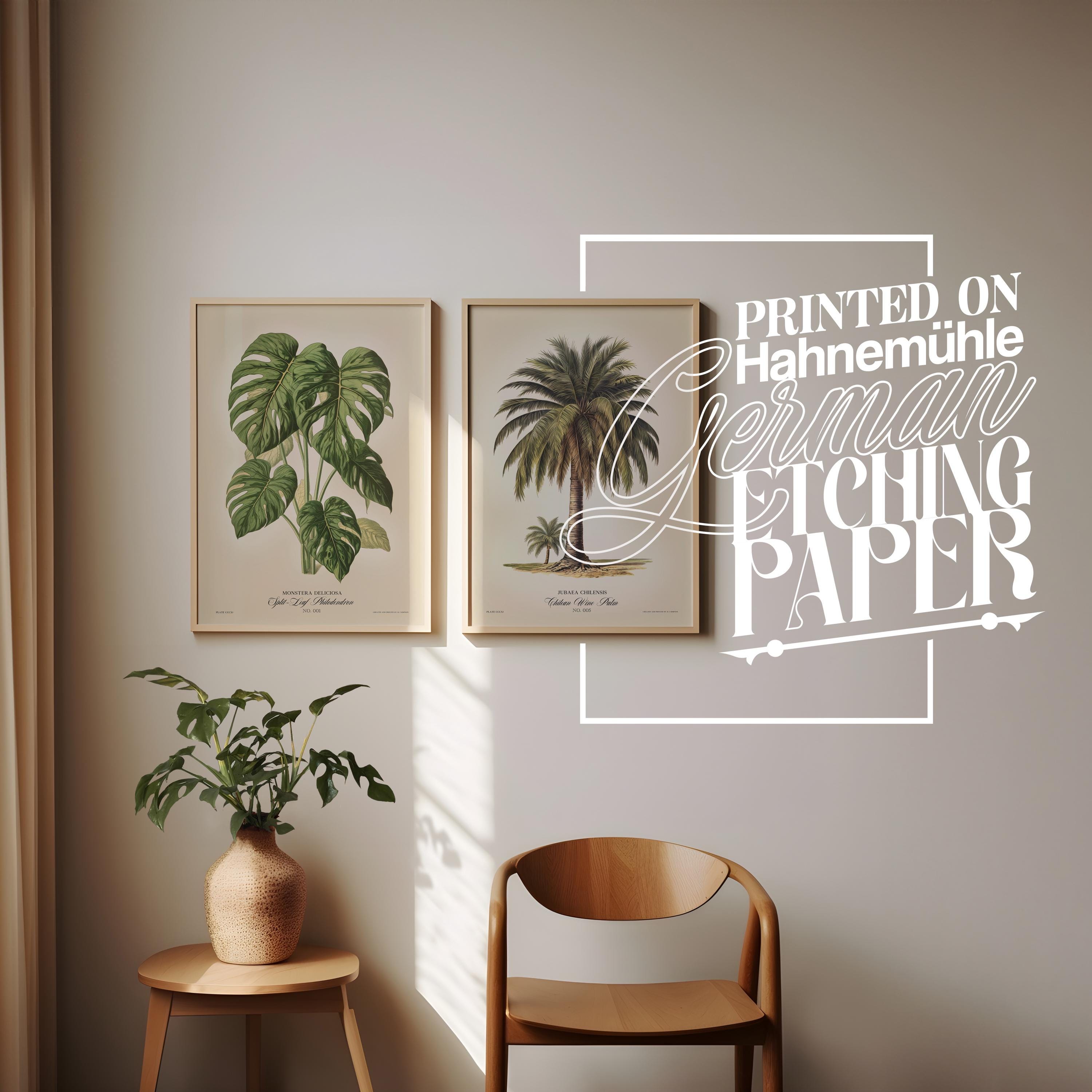
Large-leaf botanicals like monstera and palms bring a different energy.
The monstera print introduces bold shape without heaviness. Its recognisable form feels contemporary, yet its botanical rendering keeps it grounded in tradition. Paired with a Chilean wine palm or coconut palm print, the effect is balanced, lush but not tropical cliché.
Seen together, as in the paired frames image, these prints create a natural rhythm. One broad and architectural, the other tall and elegant. They work especially well in calm, neutral rooms where texture matters more than colour. This pairing is ideal for bedrooms, reading corners, or minimal spaces that need warmth without visual noise.
The Coconut Palm: Scale, Drama, and Calm
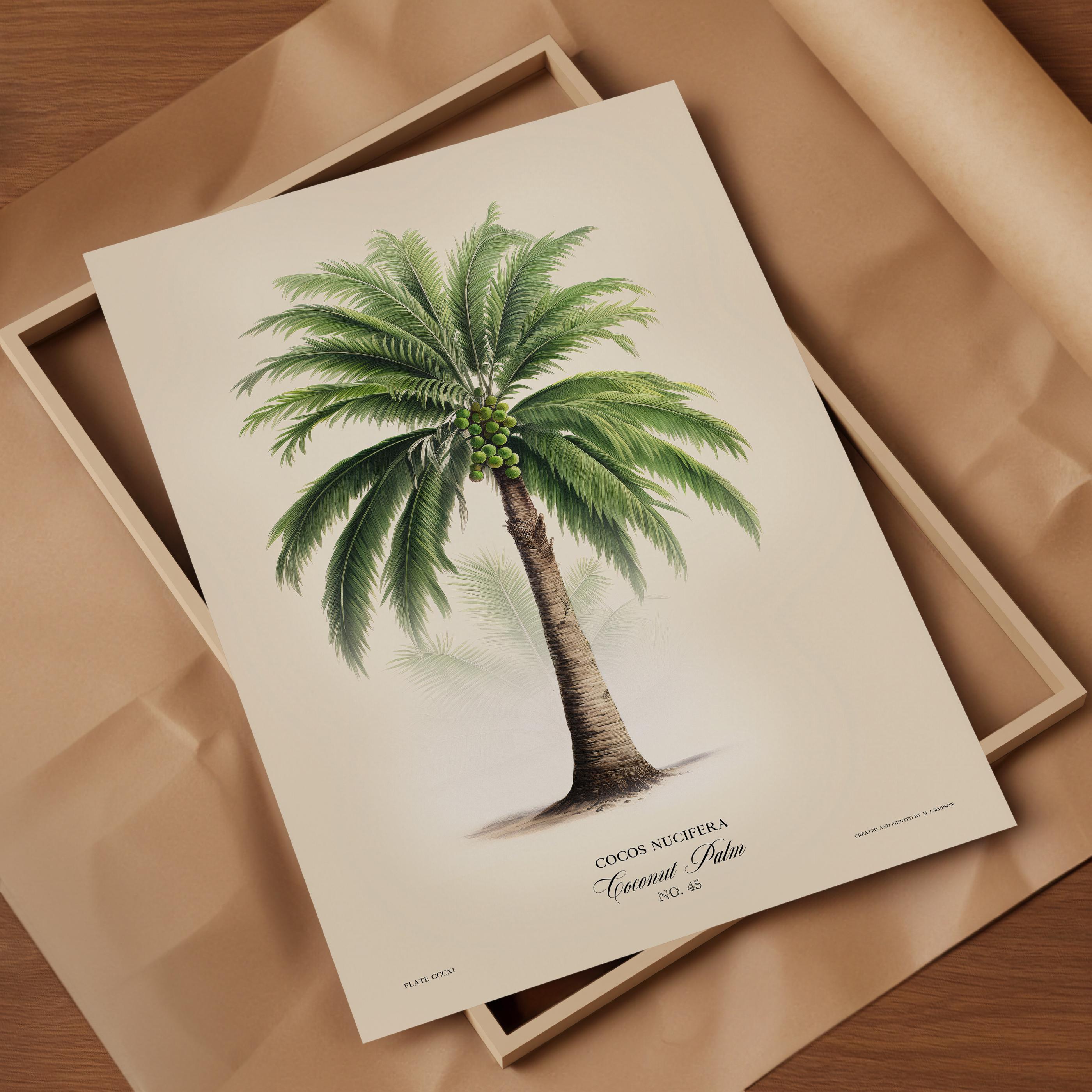
The coconut palm print deserves space. There’s a quiet drama to its height, the way the fronds radiate outward, the careful detailing of the trunk. When laid flat or framed large, it feels almost sculptural. Unlike bright tropical art, this palm illustration remains restrained. The palette stays soft. The detail invites slow looking.
It brings a sense of place... coastal air, stillness, distance... without overwhelming the room. This is a print that works beautifully on its own, especially in larger formats, where the craftsmanship can really be appreciated.
Creating Cohesion Without Uniformity
What ties these prints together isn’t colour alone—it’s tone.
The paper texture, the restrained palettes, the botanical accuracy, and the subtle typography create cohesion even when the subjects differ. Lemons, olives, monstera leaves, and palms all sit comfortably together because they share a visual language. Matching frames help, but perfection isn’t the goal. Slight variations in wood tone or scale keep the arrangement feeling natural rather than staged. Lay them out first. Let the wall breathe. Trust your eye.
Living with Botanical Art
Botanical prints age well, not just physically, but emotionally. They don’t tire you out. They don’t compete with furniture or textiles. Over time, they become part of the room’s identity, quietly anchoring the space. Guests notice them. They lean in. They ask questions. And somehow, they always feel right at home!
That’s the beauty of living with art rooted in nature. It reminds us of permanence in a world that changes quickly. And sometimes, these are exactly what your wall needs.